5 Lessons Learned While Building a Map-centric Dashboard in Tableau
It’s been a long time since I built a Tableau dashboard! My day-to-day work is now fully focused on data engineering, and I wanted to find a personal project to keep my Tableau skills sharp.
Shortly after moving to the Netherlands 2 years ago, I subscribed to Museumkaart, a local museum membership scheme that gives access to over 500 museums and galleries across the country. Every time I go to a museum included in this programme, my card needs to be scanned. And the best part (apart from seeing great art, of course) is that I can access the data about my museum visits on the programme’s website. I thought it would be interesting to see how many museums I have visited, which ones I can go to when I’m planning my next trip, and how much money I’m saving on museum tickets using Museumkaart. After collecting data on all museums included to the programme from Museum.nl and data on my museum visits, I designed this dashboard that you can explore on Tableau Public.
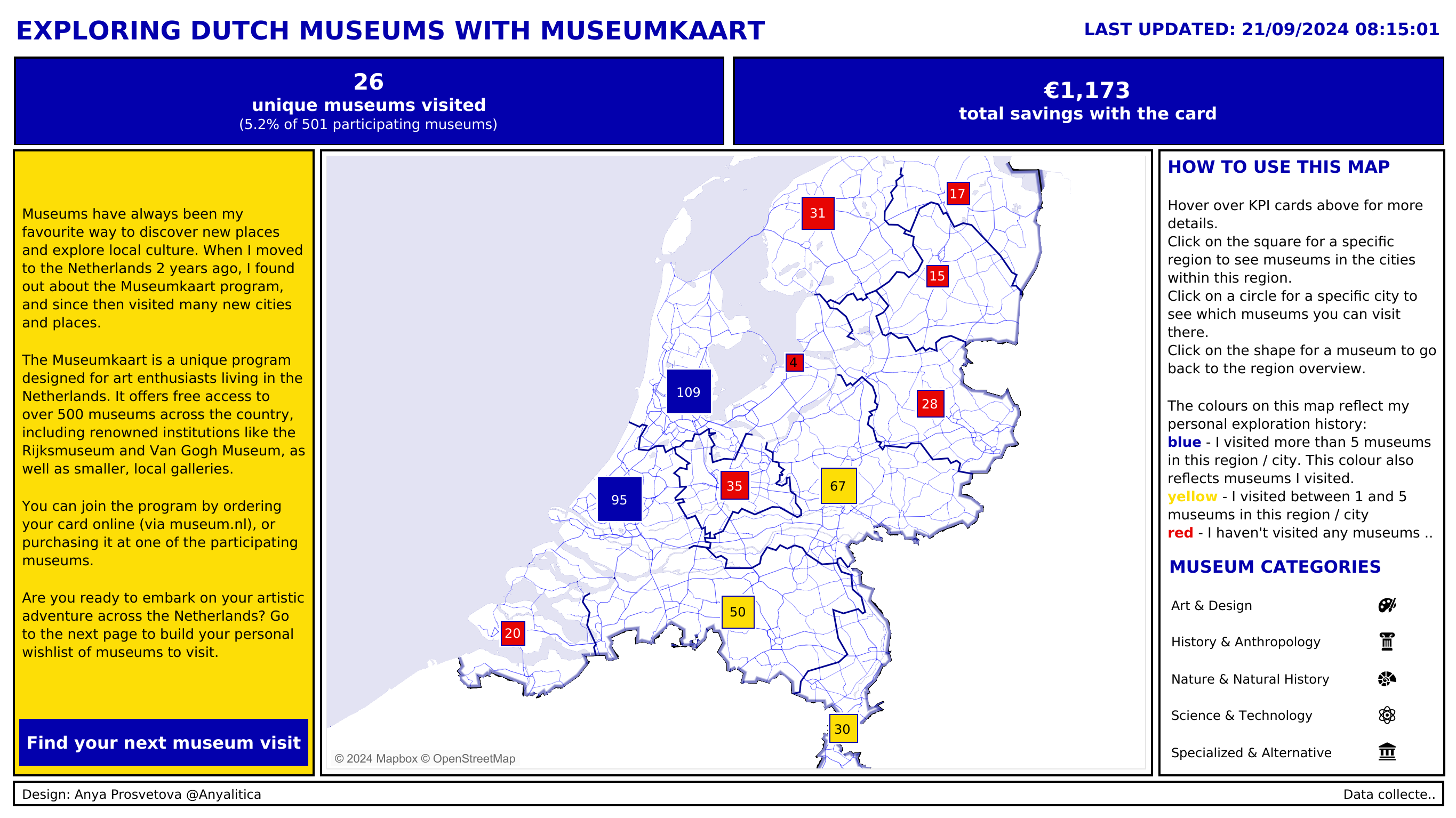
Museumkaart dashboard
This project consists of two dashboards:
- the first one shows you my personal stats and gives you an opportunity to explore museums across the Netherlands
- the second dashboard allows you to collate a list of museums you’d like to visit during your next trip to the Netherlands
As much as I enjoyed working on this project, there were a couple of moments when I had to either refresh my memory about certain Tableau features, or find solutions to issues I haven’t faced before. So, I want to focus this blog on the useful resources that helped me while working on this project.
1. Working with sets and set actions
Sets are a powerful feature in Tableau, and in this project I used it to dynamically add or remove museums to the list in the second dashboard. This video from SQLBelle was a great refresher of how sets and set actions work. It provided clear explanations and practical examples that I could directly apply to my project.
2. Designing a custom Mapbox style
I didn’t have a chance to use a custom map style in Tableau before, so this video from Marc Reid was a good introduction on how to design a custom style in Mapbox and then use it in my dashboards.
3. Issues with Mapbox map visibility
After I designed my custom map style in Mapbox, I faced an issue with the map’s visibility in Tableau Public. Although the custom map was visible while I designed my workbook in Tableau Desktop, it disappeared after the workbook was published to Tableau Public. After a quick search, I came across this Tableau Forum post from Ken Flerlage where he explained how to update the map style’s JSON file to fix this bug. And it worked like a charm!
4. Map drill-down using dynamic zone visibility
Originally, I was thinking of using a more complex solution to drill down from one map level to another, but then I remembered that the dynamic zone visibility feature was recently released. I hadn’t used it before, but watching this video from Andy Kriebel gave me a clear idea of how this technique can be applied to my project. It takes some time to create the calculations and parameters, but once you do, it works perfectly.
5. Set the correct zoom level when there is only one point on the map
Once my maps were ready and the drill-down was working as expected, I noticed that when there is only one museum in a city, the map by default zooms out to the highest zoom level. Turns out, Tableau needs to have at least 2 points on the map to set the correct zoom level. In the past, a frequent solution to this problem was to duplicate your data points, visualise both on the map, but then make the second point invisible. However, with the introduction of the BUFFER function, this can be done without data duplication. This Tableau Forum post by Sarah Battersby provides a step-by-step solution to controlling the zoom extent on your map.
I’m grateful to these Tableau community members for sharing their know-how, and I hope these resources will help you during your next Tableau projects.