Makeover Monday 2019/ Week 39: The rise and fall of Owner Move-In evictions in San Francisco
This week Makeover Monday is about evictions in San Francisco. The data set looks at how the number of evictions has been changing during 1977-2019 across the city’s neighbourhoods and types of evictions.
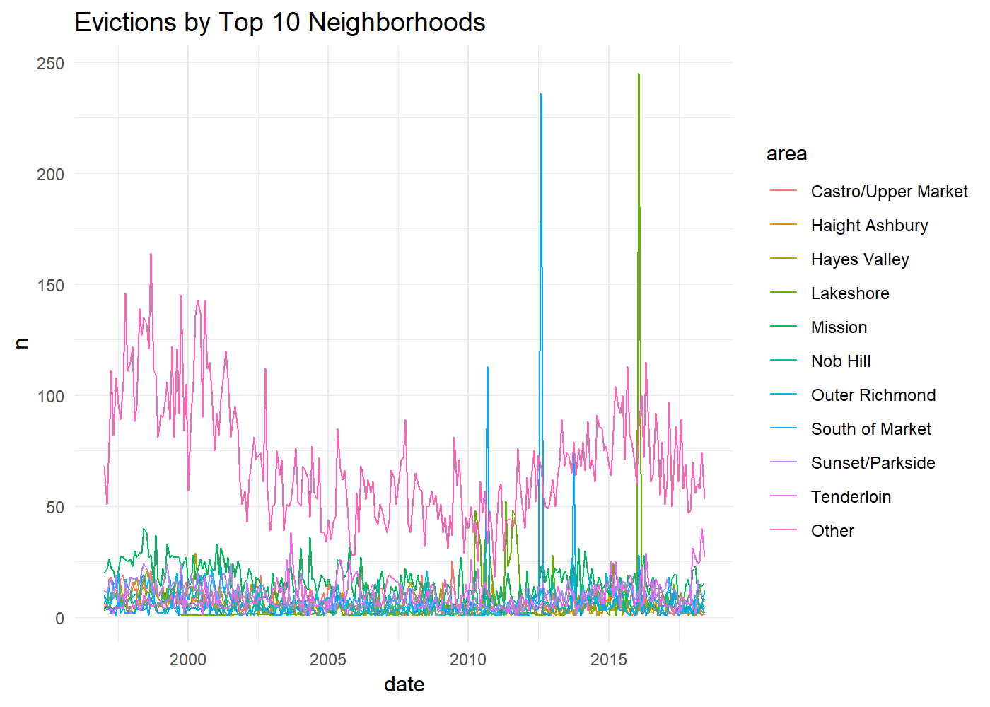
The original line graph shows the change in the number of evictions during this period for ten neighbourhoods with the largest number of evictions.

Evictions by Top 10 Neighbourhoods / Chart by Humanistic Data Science
Original Makeover Monday post and data set on data.world.
What works in this chart?
- It shows that while the number of evictions in most neighbourhoods hasn’t changed much during the review period, it noticeably fluctuated in three areas.
- Looking at only Top 10 areas, this line chart makes it easier to notice if there are any outliers or patterns.
What can be improved?
- It is difficult to compare different areas as many of them are indistinguishable from each other due to a little difference in the number of evictions there.
- Colour choice makes figuring out which line represents which area even harder.
- There are several spikes in the number of evictions, but the graph doesn’t explain why they happened.
My take on the chart

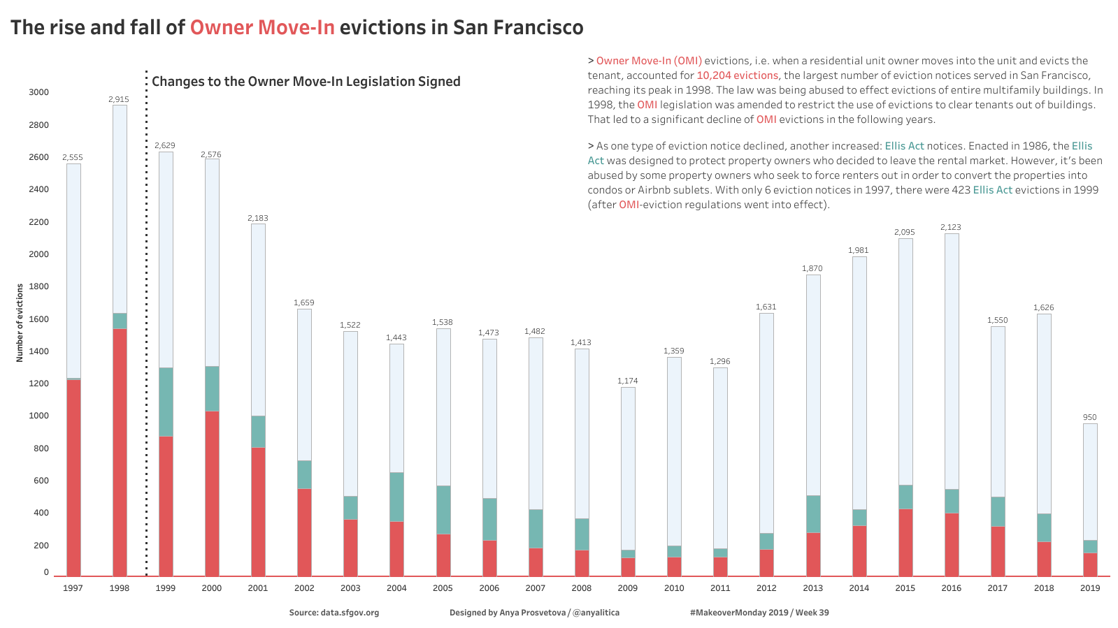
The rise and fall of Owner Move-In evictions in San Francisco / Designed by Anya Prosvetova
Looking at the data, I noticed that the largest number of evictions during the review period is Owner Move-In evictions. I found out that during the dot-com boom in California (late 1990-s-early 2000-s), many property owners used their right to evict people if they wanted to move back into their property. However, they used this reason to vacate the property and rent it at a higher rate to satisfy the growing real estate demand in the Silicon Valley.
After the relevant legislation was changed in 1998, the number of Owner Move-In evictions decreased, but the number of Ellis Act notices started rising.
This graph shows how the proportion of these two types of evictions have been changing between 1997-2019.
You can see the interactive version of this dashboard on my Tableau Public page.